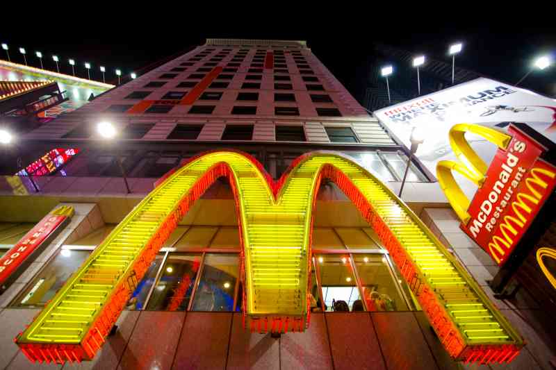
McDonald’s can arguably be dubbed as one of the most universally recognized logos in history. The bright, yellow logo is eye-capturing and can be easily noticed from a distance. Worldwide, the logo has become a staple in the food industry. Dating back to 1952, brothers Richard and Maurice McDonald planned to construct a new building to be the home of their hamburger restaurant. They wanted a new design, something that would be both efficient and eye-catching. After several interviews with architects, they presented an idea that involved two golden arches, which would be a memorable shape, and a visible one at that. The intent was to be noticed, and it has now become an icon of commercialism. A hidden symbol that has sparked some controversy, is the resemblance of upside-down female breasts, which is argued to have “Freudian applications to the subconscious mind of the consumer,” and were “great assets in marketing McDonald’s food”.

 Share On Facebook
 Share On Facebook
  Share On Facebook